
This is how our "library" looked in the Fall 2004 Issue of Country Home. The photo is by John Gruen. The styling was done by James Leland Day. Both of these really great guys worked with me four weeks prior to the C.H. shoot on the photography for Kids Embroidery. We were all happy to work together again when the Country Home editors came to photograph our farmhouse.
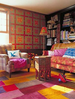
Before the shoot, my walls were a plain mossy green color - it was cosy and rich but I had always envisioned them in a kind of wallpaper-y looking design - reminiscent of William Morris and the marble floors in Venice. I didn't have enough money for the paper I desired so I took things into my own hands.
One week before the magazine shoot, in the middle of cleaning big time and throwing stuff away, I decided to transform the plain green walls into my vision.
 Here's how I did it.
I looked at this book - Auguste Racinet's Full-Color Picture Sourcebook of Historic Ornament: All 120 Plates from "L'Ornement Polychrome," Series II
I made up a pattern I wanted to paint and then sketched it out roughly. I cut up some fedex envelopes to use as templates. I traced around the templates with a regular pencil as the layers of the pattern were built up. The paint covers the pencil lines.
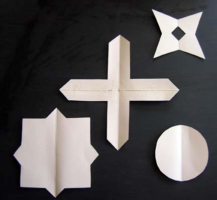 I drew some vertical plumb lines using a level and then centered the cross on the plumb lines working out from one corner of the room. I traced around the cardboard "plus" pieces and then painted them with red latex paint from the paint store.
Next, I added the square with diamond eight pointed blocks in the center of each opening that resulted from the red + motifs. I traced around the template and then I painted these in a peachish shade freehand (that ended up going a little tan when viewed with the other colors). For all the other colors, I mixed small amounts of artists' latex paint - enough to finish each section of the wall as I went. Trust me, I wasn't sure how this all was going to work out. I just went with my instincts and hoped for the best.

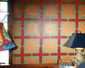
Next, I added alternating circles of medium teal and yellow. On top of each circle, I added a x-ish shape in orange.

To finish the whole project off, I used a fine brush and black acrylic paint. I hand lined each shape to make them pop off the wall and make it all look more hand-done and artistic.

It took me two to three days of at least eight to ten hours a day to finish but I love it - as does Mark and Julia. It's vibrant and cozy at the same time. Luckily the ceilings are low and I didn't even need a ladder. Sorry the photos aren't so great. I just found them laying around and thought they might make a fun blog post. Three years ago, I never thought I would have a blog nor did I have a digital camera. My things have changed.
Please don't ask me to help you with your project..... I just don't have time. Just know that it's easy if planned out. Buy this book - Paint Recipes by Liz Wagstaff - it's great for faux finishes (although there isn't a lot about building patterns) - and figure out your own design. If you're nervous, figure it out on paper first and hang your painted sample on the wall. Look at it for a week and then decide if you like it enough to take the time to paint it.
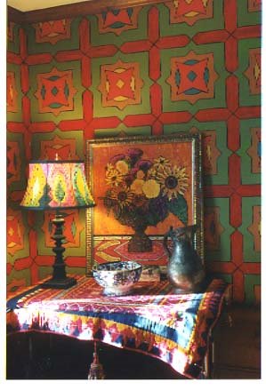
Remember, paint is cheap but the result can be wonderful. And if you're not happy with it, paint over it and try again. Here's what it looks like today. I still like it three years later and have no plans to change it for awhile.

18 comments:
This design is great - I love the contrasting colors, and the bold effect. I started knitting Little Majolica, and my friend commented that it reminded her of William Morris, whom you mention here! One day when I have my own place to decorate, I plan to embark on a project such as this. Thanks for sharing your process.
how fun is that!! it would be great to do that on a floor too! thanks for sharing.
ps. i'm wondering about the rug?
I just love seeing photos of your house! This is really fun to see the process of this!
I'm also wondering about the rug.
Hi kristin!!
I too am wondering about the rug!!
lucinda
www.wildwoolsayrn.com
This is great! I'm moving into my first apartment in the Fall and I'm so inspired now!!
very cool. i'm also relieved to hear that all of those beautiful houses you read about in country home, or other mags don't always look like that ;)
Your room is really stunning! Thank you for sharing the process, it's so interesting to see how these things are created.
My stitchery kit finally arrived yesterday, and I've already finished one of the flowers. It's a lovely kit, the linen and the wool yarns are so nice! Thank you!
Very nice room! I would looove to do some color in our new-to-us and moving in soon house but everyone else in the family likes plain white walls! I am so tired of white! I must do something like this in my office/woolroom! You've inspired me!
What a transformation. It lifts the whole room. Can I add my name to the list of those who want to know about the rug too! Is it knitted, felted or neither?
I've just discovered that there are some William Morris and Burne Jones windows in a church not a million miles away from me. V excited...must go and see.
Thank you so much for showing the pictures and the step-by-step-instruction. Your wall is incredible wonderful, I love it and wish I would be bold enough to follow your way of colouring my home. Till that day I stay with my plain white walls and wait for a visit at Standen of William Morris, maybe afterwards my mind has changed completely.
For all you who want to know about the rug - it isn't mine. It came from a place called "The Rug Co." which has a place in NYC and London. It was something called a Perde Patchwork rug. Yes it was beautiful.
Since James, the freelance stylist, had been here for the photos for Kids Embroidery, he knew my house. He studied it after the KE shoot was over. Then he was hoping he would get the C.H. job - He did.
He was worried that my rugs were too dark (they are persians in the patterns you can imagine me having). I told him I didn't care if he brought in some things he borrowed from sources as long as they looked like they were something I would own. I loved them. They were more expensive than something I would have. They were also flat weaves which don't do too well around here with all the animals. I used to have some and they were tough to vacuum and didn't hold up. But yes, I agree they were beautiful and they lightened up the photo. I have very small windows (old house) and so there isn't a lot of available light for natural photography. Magazines usually want only natural light so sometimes, you've got to do some tricks.
I learned a lot from the photo shoot. Now, I analyze all kinds of magazines, look at the sources, etc. It's kind of a fun game.
Kristin
Wow, I followed a link to here from Charleen's Fiberblog. You are so clever. Better than wallpaper!
Oh, that is totally excellent!
Stunning! That wall is simply stunning! :)
these walls look like somethign form Charleston house...owned by Vanessa Bell and Duncan Grant of the bloomsbury group. So pretty!
http://www.charleston.org.uk/
Fantastic room! I thought that was a quilting up there. Amazing.
Sandy
How inspiring! What a gorgeous room, Kristin. I've been wanting to paint my boring, white kitchen cabinets since we moved in five years ago--I've known what colors I want but haven't been able to visualize what I want to do with them. So seeing the shapes that formed your wall pattern is very helpful. I can almost hear the cogs turning in my brain!
Post a Comment